Thanks again to everyone who voted and participated in choosing curtains for Lucy's room! (If you would like to see all the options again, click here) Option 3 won, and after lots of thought and a ton of math, I am done with the curtains!!! I am so pleased with how they turned out!
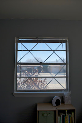
Here is the room Before:
 The south window looks toward our neighbor's house.
After the voting results were in, and option 3 won, I was really excited to start on the curtains, partly because two voters shared some decorating tips, and had an educated reason why they voted the way they did. :)
Nina (Who happens to be a professional interior decorator!):
"HELLO THERE,MUCH FUN AND PLEASURE FOLLOWING YOUR BLOG. My vote is no 3 as most shapes in the room are square and I think I would like to see some softness to add more interest- as for the buttons=perhaps a cork board edged in rickrack with buttons mounted on the largest rickrack. Love your house.Love your daughter..Adorable....Love Nina"Rachel:
Here is the room After: "Although #1 and #2 are unique, I like #3 best because it is softer. It seems like there are already a lot of boxy shapes and hard lines in Lucy's room -- the dresser, cubby shelf, crib, door and window frames -- I think the space would feel pleasant with the softness of #3, albeit it is not as unique as the others."
How great right? I love that these two friends, although they don't know each other, thought the same thing. :) You know what they say about great minds... :)
I was excited to add some softer lines to the room, and turns out - it helped a lot!!
I was excited to add some softer lines to the room, and turns out - it helped a lot!!
 The windows both started at different heights, but I wanted them to "look" uniform, so I measured 10" down from the ceiling and 4" in out on ether side of the window, and put the curtain rod there, well, Brad put the curtain rods in (thanks hun!).
 I lined the curtains, and I am so glad I did - the outline of the window is much less evident. We hung them on wide pocket curtain rods, which helped give the straight look I was going for at the top. I simply pinned the ribbon "tie ups" into a loop with a straight pin, easy schmeezy. :) Like I've said, I am in love with the results - every time I walk in Lulu's room, I have to smile. :)
The full reveal of Lucy's room will be coming soon! :)
What do you think? Do you agree with Nina and Rachel? Was the room screaming for some soft lines? Or are you still pouting because your vote didn't win? :)


3 comments:
The dresser in the picture looks like a happy face......seems the furniture is happy with the new curtains:)
adorable! and i love the paper lanterns!
Oh! I feel very honored having my comment on the main page!
The room looks delightful! You guys have been working hard.
Post a Comment